
Wednesday 16 December 2015

Tuesday 15 December 2015


Tuesday 8 December 2015

Saturday 5 December 2015


Music magazine evaluation in depth
Firstly the front cover:
the front cover of a music magazine is loud and always speaks to the audience, and this is no acceptation the dark background brings out the bold text and the individual within the main image, the title "Metal Hammer" is so iconic that it is still recognisable even when only partially shown. they use a simple color scheme of white, gold and red this keeps the design simplistic but still draws attention to the individual items.
The headline WIN! is in gold drawing attention to it as well as having an icon in the same color also draws attention to it over other items. this entices the consumer to read on due to the fact they can potentially win. following this is the key things within the magazine that will appeal to a larger audience and not just niche audiences.
The main image is of Slayer the tag line is The rise of the kings of hell thereby they have made the main image look as if he is pinhead from the film Hellraiser, this also fits in with the genre of metal being demonic or of a dark origin. this is also reinforced in the bottom left corner where the + signs are upside down cross's.

The contents page:
the left side is a brief intro to the magazine and the band that is the main image, on the right is a contents page with the key items that are within the magazine with a quick paragraph explaining it in slight more detail. images have been included to entice the audiences that know and recognise the bands so they can skip to the page with there favourite band on. below across the double page is an advertisement for there online app this is a smart idea as no one or a very small minority will skip this page.

The double page spread:
The band name is printed across the top of the double page spread in a colour that keeps the theme of the band within the image as bad boy motorcyclists, the band is looking straight at the camera in a long shot with the text cutting them at the waist. large letters "F" and "T" and one large sentence is printed in a bold white text to make the text seem less boring than if it was just one big blob of text.

The Advertisement page:
cut into equal blocks with the posters of each band within them this allows up to 8 adverts across a double page, that are all related to the magazine.

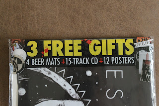
Free stuff:
To entice the audience into buying them magazine its in large yellow text, meaning it would be very hard to miss.
Subscribe to:
Posts (Atom)