
Wednesday 16 December 2015

Tuesday 15 December 2015


Tuesday 8 December 2015

Saturday 5 December 2015


Music magazine evaluation in depth
Firstly the front cover:
the front cover of a music magazine is loud and always speaks to the audience, and this is no acceptation the dark background brings out the bold text and the individual within the main image, the title "Metal Hammer" is so iconic that it is still recognisable even when only partially shown. they use a simple color scheme of white, gold and red this keeps the design simplistic but still draws attention to the individual items.
The headline WIN! is in gold drawing attention to it as well as having an icon in the same color also draws attention to it over other items. this entices the consumer to read on due to the fact they can potentially win. following this is the key things within the magazine that will appeal to a larger audience and not just niche audiences.
The main image is of Slayer the tag line is The rise of the kings of hell thereby they have made the main image look as if he is pinhead from the film Hellraiser, this also fits in with the genre of metal being demonic or of a dark origin. this is also reinforced in the bottom left corner where the + signs are upside down cross's.

The contents page:
the left side is a brief intro to the magazine and the band that is the main image, on the right is a contents page with the key items that are within the magazine with a quick paragraph explaining it in slight more detail. images have been included to entice the audiences that know and recognise the bands so they can skip to the page with there favourite band on. below across the double page is an advertisement for there online app this is a smart idea as no one or a very small minority will skip this page.

The double page spread:
The band name is printed across the top of the double page spread in a colour that keeps the theme of the band within the image as bad boy motorcyclists, the band is looking straight at the camera in a long shot with the text cutting them at the waist. large letters "F" and "T" and one large sentence is printed in a bold white text to make the text seem less boring than if it was just one big blob of text.

The Advertisement page:
cut into equal blocks with the posters of each band within them this allows up to 8 adverts across a double page, that are all related to the magazine.

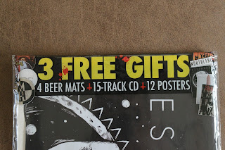
Free stuff:
To entice the audience into buying them magazine its in large yellow text, meaning it would be very hard to miss.
Monday 23 November 2015
My history with metal.
For my chosen genre i am doing metal.
Below i have stated the history of metal and a brief outline of what type of metal i like, however i thought i would outline my first encounter with metal as well as why i like it among other things.
 My first encounter with metal was when i was around 7/8, i had recently gotten a new sounds system for my room and was looking through my dads old CD's. I found many old and interesting bands that was all brand new to me. i must of been through about 50 CD's and found about 2 or 3 bands that i really did like, and then i found a really old looking CD with large writing in a type of bogey writing across the top, "ugly kid Joe" on the front cover was a a large statute of a green man (statue of liberty however i did not know this at them time) sticking his middle finger up to the world (i had no idea of what this meant until i did it at home and got sent to my room) and holding magazines in his left hand. so i put it in the CD player. My world was blown away, the heavy guitar the screaming and i remembering thinking, why is this so different, so loud and so violent.
i must of listened to the album 4 or 5 times in a row i loved it. From there my love grew, finding new bands such as slipknot old bands such as slasher from there i have kept tabs on the metal world through such magazines such as metal hammer.

House style of metal hammer

Tuesday 10 November 2015

Monday 9 November 2015


Wednesday 21 October 2015
My first full magazine cover

I used bold IMPACT to write with to draw attention to my magazine i also used faded shapes to highlight certain information to make it stand out more and used large numbers to do this also. i underlined everything and used a white text color to give the cover a professional look.
Sunday 11 October 2015


My own made mastheads
 |
| Some ruff ideas on how I would like to see my masthead. Each one is unique and still draws attention to them. |
Monday 5 October 2015
Magazine templates
 |
| My first attempt at some templates for a school magazine, all including main image and title slots, as-well as contents slots. |
Friday 2 October 2015
Photography and what ive learnt so far.
Portrait Photography:
 Rule of thirds: By using the rule you gain focus the attention on a specific item of individual, the rule of thirds consists of spiting the screen of setting into a gird with 3 lines horizontally and 2 vertically, you then put the individuals eyes on a line or cross section this draws attention to them or the item.
 Depth of field: Is another camera technique also called focus range or effective focus this is when you focus on one specific thing in say the foreground and the background becomes blurred or vice versa. This is great to really draw the attention to the subject in focus such as a individual or other. It also makes the whole picture stand out as it is a bit different and unique compared to a normal image.
lighting: I also learnt how to let natural and unnatural lighting into the picture and how to use it for different effects for example hard light vs soft light, so hard light will create very dark shadows and really stand out to the viewer whereas soft light is smooth and has very few shadows so it is just even and gives more of a clean crisper look to it.
 Visual lead in: this is when an object or surface is used to guide the viewers eyes to the central focus point, this is a great tool which allows you to actually break the rule of thirds if you wish to for example a bridge going along draws the attention to the middle section and also looks amazing when combined with the two previous rules above in some way.
 Movement: now this was an interesting one as it was quite difficult to capture on school cameras as you can not alter the exposure however if you were to have a long exposure you could capture the movement of one thing while the still items stayed still obviously, this creates an interesting effect on light etc for example a highway if you were to set the exposure high you would capture moving lights but the highway would stay in the same place. However on the school cameras you would get very little blur to see the movement yet would get a clear image of the item or individual in that movement position.
Subject/Model position: this is key and also applies to the rule of thirds however these again can be broken to make unique looking picture, however you also need to determine if the model or subject needs to be in the foreground or background and what focus you want. so basically all other rules can be changed dependent on this one rule.

 Rule of thirds: By using the rule you gain focus the attention on a specific item of individual, the rule of thirds consists of spiting the screen of setting into a gird with 3 lines horizontally and 2 vertically, you then put the individuals eyes on a line or cross section this draws attention to them or the item.
  Depth of field: Is another camera technique also called focus range or effective focus this is when you focus on one specific thing in say the foreground and the background becomes blurred or vice versa. This is great to really draw the attention to the subject in focus such as a individual or other. It also makes the whole picture stand out as it is a bit different and unique compared to a normal image.
lighting: I also learnt how to let natural and unnatural lighting into the picture and how to use it for different effects for example hard light vs soft light, so hard light will create very dark shadows and really stand out to the viewer whereas soft light is smooth and has very few shadows so it is just even and gives more of a clean crisper look to it.
 Visual lead in: this is when an object or surface is used to guide the viewers eyes to the central focus point, this is a great tool which allows you to actually break the rule of thirds if you wish to for example a bridge going along draws the attention to the middle section and also looks amazing when combined with the two previous rules above in some way.
  Movement: now this was an interesting one as it was quite difficult to capture on school cameras as you can not alter the exposure however if you were to have a long exposure you could capture the movement of one thing while the still items stayed still obviously, this creates an interesting effect on light etc for example a highway if you were to set the exposure high you would capture moving lights but the highway would stay in the same place. However on the school cameras you would get very little blur to see the movement yet would get a clear image of the item or individual in that movement position.
 Subject/Model position: this is key and also applies to the rule of thirds however these again can be broken to make unique looking picture, however you also need to determine if the model or subject needs to be in the foreground or background and what focus you want. so basically all other rules can be changed dependent on this one rule.

Wednesday 23 September 2015

Tuesday 22 September 2015

Sunday 20 September 2015

Thursday 17 September 2015
Website review
Firstly id like to talk about Tube Chop.

Tube chop is a great you-tube video cutter, you can crop the start and end easily and effectively really quickly with is basic format and drag options anyone can use it. However the basic aspect of it lets it down as you can only crop the beginning and end therefore you can not crop the middle or edit the video in any other way, the webpage also has many advertisements around the edges which can be a distraction especially if your trying to find a specific point in a video to cut from the start or end. Overall i love the basic aspect and easy to use functions of the site however being unable to cut from the middle without cutting out the start is a real let down as well as being quite complex to included it into say a "blog" with the embed code etc.

Tube chop is a great you-tube video cutter, you can crop the start and end easily and effectively really quickly with is basic format and drag options anyone can use it. However the basic aspect of it lets it down as you can only crop the beginning and end therefore you can not crop the middle or edit the video in any other way, the webpage also has many advertisements around the edges which can be a distraction especially if your trying to find a specific point in a video to cut from the start or end. Overall i love the basic aspect and easy to use functions of the site however being unable to cut from the middle without cutting out the start is a real let down as well as being quite complex to included it into say a "blog" with the embed code etc.
Another thing id like to talk about also is Wordle
This great website will make you aggressive in a matter of seconds from the old java plug in required to the great fun of a white screen at the end. if you eneter a bunch of relevant key words into the box as requested nothing happens, if you choose to use an rss feed nothing happens if you need a word cloud here is definitely the place for you wordle... seriously if you want to make a good authentic word cloud just go to word it out at-least here it actually works with multiple fonts and colours to choose from.
Common features within music magazines.


- A common theme is the red and black logo which is very bold, usually wrote in block letters also usually in the top left of the cover or across the top.
- Another thing i noticed is how the text is appropriate to the audience for example DJ (left) uses crazy chaotic writing in a bold white text this matches with the main image also and is constant throughout the main cover not just on the anchorage.
- The main image on all covers is a bold and a stand-out individual that match's the colours present this draws the attention to the individual.
- Many times the key individual or the main image is in-front of the title also this creates a curiosity to the reader.
- A variation of colour within the anchorage and cover links is also very common as this draws the attention of the reader to the main information.
- Another thing that is common among music magazine is to include free items from CD's to posters this entices people to buy their magazines over the other ones.
- A lot of magazines also use quite vibrant colours such as pinks and yellows in specific places such as the taglines.


Subscribe to:
Posts (Atom)